 Here's a bit of type I put together this morning. I used a font that I made using fonstruct, and then tried to give a 3d feel with some CMYK crazyness. I seem to have lost the 3d effect route that I was going down, I want to pull it back to that. No Doubt this would give me a headache if I came to screen print it! I'm still working on the impossible triangle idea too, more pics to come.
Thursday, 10 December 2009
dont panic continues...
Here's a bit of type I put together this morning. I used a font that I made using fonstruct, and then tried to give a 3d feel with some CMYK crazyness. I seem to have lost the 3d effect route that I was going down, I want to pull it back to that. No Doubt this would give me a headache if I came to screen print it! I'm still working on the impossible triangle idea too, more pics to come.
Monday, 7 December 2009
type ideas for dont pan!c
 I am trying to develop my use of type within the D&AD brief. I intend to explore the impression of 3d text and optical illusions, in combination with the style I have already developed this far. I think negative space could potentially work really well too. I will hopefully do some more wor today/this week and add another update!
Wednesday, 2 December 2009
I'm going slightly mental.

Here is my latest poster design for the D&AD brief, it's a bit crazy. I got tired of trying to make something with a solid meaning and instead decided to throw together something that I actually liked and enjoyed making. It includes a slight wobbly reference to Back to the Future, I was thinking of time travel and how I could incorporate this into the poster. I'm also thinking of life and death, and ways in which you could avoid it - time travel? Meh, who knows. There is still a huge amount of room for improvement and I intend to develop this a hell of a lot more in the next few weeks.
Most of my ideas for this project involved the use of coloured acetates laid over the image, or in the form of 3d goggles, to reveal hidden messages in the image. Even though this was considered 'gimmicky' it's still something I want to persue. I think it gives more interaction between the viewer and the image. So for best results in future, get out your old 3d goggles/red and blue acetate! More images to come soon...
Saturday, 28 November 2009
The state of my studio space

Got some of the zine pages arranged here - including stuff from Kat and Chantal. Still waiting for Neil to finish his before we start trying to work out the layout. Hopefully will be finished in the next week.


My wall in the level two studio. It's getting pretty full of posters and prints now. Might have to get rid of some of it to make space for the new bits and pieces on the way from the D&AD project.
I printed my initial poster design on beige sugar paper, looks nice in the 'flesh'. Slightly wocked. I also did some overlays with a few different colours, trying to come up with something that would look completely different when you look through different coloured acetates. More to follow.
Friday, 27 November 2009
D&AD brief fumblings
 I'm pretty screwed at the moment in terms of my D&AD brief. I've been struggling to find a subject to base it on, related to the subject of 'resistance'. I really like the style of propaganda posters, and the work of obey/go media etc. I kinda want to combine this with a bit of drawing if possible, and mix up my processes a bit. If I have time I want to do some screen printing and overlaying, perhaps including colour and hidden messages.
 This specific design is a little poke at the frustration and annoyance caused by the abysmal printing system at the university. honestly, for an arts-based uni we should have a much, much better printing system that actually churned out some nice prints. It's vital for us, but it seems the uni is more interested in taking our money and rodgering us with champagne bottles. We will have to see if we can do something about it.
I want to make some red acetate glasses too....
Saturday, 21 November 2009
personal project - Zine. So...


A few images I intend to use for our self initiated zine project. Our theme was 'black and white', after a bit of thought, I settled on a samurai-inspired set of images. I had thoughts of darth vader and the death star, but then I think I've done quite a bit of that recently...The pattern above was inspired by the pattern on a piece of samurai armour. As for the samurai mask/helmet, I have wanted to tackle a vector of one of these for ages. We intend to get it all put together within the next few days, so I should have some more shots of the finished article up here soon.
Friday, 13 November 2009


Monday, 9 November 2009
screen prints
Here are a few screen prints from my session the other week. If I can get into the print making studio again sometime soon I might use my own screen and print this design onto a t-shirt or two...


Saturday, 7 November 2009
Myth of Origins brief
 I have just 'finished' my Myth of Origins brief, but I still have a lot of work to do. I'm not happy with my outcomes or the direction I ended up floating off in. I intend to do a whole lot more experimentation in the next week, incorporating typography, collage, photocopying and a bunch of other whacky sheet if I can. I need to make it all much more visually interesting, and luckily for once my crit was helpful in making me realise where my downfalls were.
 I have added a few of the half decent images from this brief to my website, you can find them here.
I have also finally received my Canon 50D, so I will probably take some better images of my printed work and upload them here pretty soon, including my recent vader screen prints and other assorted junk that I've had lying around for a bit.
Monday, 2 November 2009
Vader

A new illustrator design-come-screen-print idea. I have always loved the aesthetic of Darth Vader's helmet, what a legend. Seeing as I'm really into shearing rectangles and putting them on a 45 degree angle in illustrator right now I thought I'd add a few of them too. I have screen printed this design onto some nice brown paper with silver black ink, will add them to the website/blog when I get my new camera and can take some pics.
Thursday, 29 October 2009
Pumpkin Fun Times


Wednesday, 21 October 2009
Fontstructions
I recently discovered FontStruct through that online revelation, twitter. I have been getting to grips with it, here are a few of my creations.


Thursday, 15 October 2009
Tea animation
The 'final' piece for my stop frame animation project. I'm thinking of doing another one, concentrating more on drawing and close up macro images perhaps.
Tea Animation from grant Killoran on Vimeo.
Saturday, 10 October 2009
a tad more type
A couple of days ago I attempted to create my own typeface in Illustrator. It was my first real attempt at it. I have added a piece using the type to the digital section of my website....here. I have a few more quotes/type ideas for it lined up, will most likely end up on the studio wall before long.

Updated the post with something I quickly shoved together. I want to try screen printing something using this type.
super-happy-fun-times
These designs are part of an idea for my stop frame animation. It all centres around a polystyrene ball. 'Nuff said. More info to come as I get on with the filming and editing...

Obviously influenced by retro-wocked japanese ads/product design. I'm hoping I can incorporate some of this style into the animation itself. I'm thinking of trying to make the stop frame a kind of advertisement for a new product.

Thursday, 8 October 2009
Friday, 2 October 2009
the right type?
 the finished article. Will probably work up a few...ALTERNATE versions of this. Looking at greek and phoenecian lettering. Who knows if anything will come of it.
This has been added to a new section of the digital element of my website - here.
Wednesday, 30 September 2009
Type...in progress

A screen shot of one idea I've had for the summer project. I wanted to experiment with typography, this is the closest I've come to something half decent so far. The type is based on the number of seconds I have been alive so far, I thought it was quite a nice alternative way to look at age - over 600 million seconds old. I feel ancient.
Monday, 28 September 2009
Website Updated
 I have updated my website yet again, wasn't completely happy with the last version. Now all I have to do is make some more work to put on it...
Monday, 14 September 2009
ALTERNATE

For the summer project, I'm focussing on the word alternate. I've been trying to come up with some ideas, looking at braille, and generally crapping myself. I haven't even got a sketchbook yet, but hopefully I can finally get round to doing some work. Here is an early mock up of an idea I'm experimenting with. I want to do some abstracted/weird/random portrait things...
Friday, 21 August 2009
I've been trying to experiment with my photography, and wanted to do some long exposure shots. My fumblings can be found on Flickr as usual.

Saturday, 8 August 2009
The First Film
I was a tad relieved to see that my first roll of film from the Zenit actually came out ok, a little on the over-exposed side but I tidied things up in Photoshop. I actually had a nightmare last night that I was handed the film with the words 'BAD FILM' stamped on the side! I wondered up to dartmoor the other day and got some shots of the ponies just as a tester to see how things went. No problems with the camera it seems, but the manual aperture setting will take a bit of getting used to.

I want to give portrait photography a go, especially with 35mm, so thats probably what the next film will be wasted on. I have posted some of the pics on Carbonmade for your viewing pleasure.
Monday, 3 August 2009
Zenit-E
I had been wondering the charity shops of Winchester for weeks, on the look out for an old manual SLR. Nothing. Then when I came back to Devon for the summer holidays, luck led me to wonder into a charity shop in paignton when I was there for the day. I found this old knackered case on one of the shelves and sure enough, it was a manual SLR!! wahey! It seems to be in working order, I have taken a film with it and will have to wait and find out whether the pics will come out.


Saturday, 25 July 2009

Friday, 17 July 2009
DA Portfolio
DeviantART have released this new portfolio thing, seems quite dandy.
grantkilloran.daportfolio.com - here's the link to mine. Not much on there at the moment...
grantkilloran.daportfolio.com - here's the link to mine. Not much on there at the moment...
Wednesday, 15 July 2009
Feminism @ Don't Panic
As everyone knows, I am a massive fan of feminism. I didn't even think I would enter the feminism poster contest on don't panic, and yet again I've left it really late to enter. But today I came up with an idea for a few images, and I thought this one fitted the bill fairly nicely...well. It's the best I'm going to do without infuriating a load of women no doubt.

I was thinking today that I'd like to do a series of them, a bunch of fairly abstract black white and pink vector images all based around women.


I was thinking today that I'd like to do a series of them, a bunch of fairly abstract black white and pink vector images all based around women.

Busy...
I have been a bit busy recently, arsing around with web design and CSS. I have been designing the SAUCE collective website with help from Kat, as well as beginning the process of updating my own site. It's going to take a while, I'm trying to keep illustrating/drawing but the days are flying by! And I need a job! Argh!

Saturday, 4 July 2009
oh no...more Banksy
Some images from the banksy exhibition in the Bristol Museum. I'm sure hundreds of thousands of people will be putting up images of this stuff all over the web. but hey, it's research.


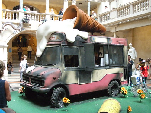
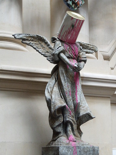


It was a good exhibition, the best one I've been to in a long time. I'm not a massive fan of Banksy, but his work was really well considered and very cleverly executed. Most of the time people were wondering around the museum expecting to see a bit of Banksy inserted into the regular pieces on show. A highlight for me was the pink dildo amongst some examples of stalactites and stalegmites. Sadly I don't have a photo.
I have more pictures on my flickr here.
Subscribe to:
Posts (Atom)
